People need to see a brand many times before they remember it. If your Instagram posts, website, emails and ads all look different, each impression starts from zero. A consistent visual identity makes every piece of content reinforce the others, so a small business with a modest budget can feel as recognisable as a much larger one.
Quick answer: A consistent visual brand identity comes from a small, documented system: a logo in a few versions, two or three core colours with exact codes, one or two fonts, a defined image style, reusable templates for every format you publish, and a short brand guide that everyone follows. Apply it everywhere, from your website and social profiles to email, packaging and ads.
Why consistency matters
- Recognition: repeated colours, shapes and styles let people identify you before reading your name, which is valuable in fast-scrolling feeds.
- Trust: a polished, consistent look signals a professional, reliable business. Inconsistent visuals can make even a good business look improvised.
- Speed: with a system in place, creating a new post or page takes minutes, not hours.
- Scalability: freelancers, new staff and AI tools can produce on-brand work when the rules are written down.
The building blocks
1. Logo system
You need more than one file:
- Primary logo: the full version for your website header and documents.
- Icon or mark: a compact version for profile pictures, favicons and app icons, which display as small circles or squares.
- Light and dark versions: for use on dark photos, dark mode and coloured backgrounds.
Keep the originals as SVG (vector) files, and export PNG versions at the sizes each platform needs. See LinkedIn image sizes and the social media image sizes cheat sheet for profile photo specs.
2. Colour palette
Choose two or three core brand colours plus neutrals for text and backgrounds. Record exact values: hex codes for web, RGB for screens and CMYK for print. Check contrast between text and background colours so your content remains readable and accessible; the WCAG guidelines recommend a contrast ratio of at least 4.5:1 for normal text.
3. Typography
One font for headings and one for body text is plenty; many brands use a single family in different weights. Choose fonts that are readable on phones and available for web use. Define sizes and weights for headings, body text and captions so layouts stay consistent. If you want to test a decorative treatment for a social graphic, Fontyle lets you preview and export styled text before deciding whether it fits your brand.
4. Image style
This is where many small brands are least consistent. Decide:
- Photography: natural or studio light, warm or cool tones, busy or minimal backgrounds, people or products.
- Editing: one consistent preset rather than different filters per post.
- Illustrations and icons: one style (line, flat, 3D) rather than a mix.
- AI-generated visuals: when they are acceptable and how they should look; see how to choose an AI image generator.
Original photography of your real products, place and people usually does the most for trust. See visual content marketing.
5. Layout and graphic elements
Recurring shapes, borders, frames or patterns become recognisable over time. Define logo placement (for example bottom right, always the same size), margins and how text sits on images.
6. Voice
Visual identity works alongside verbal identity. Write three adjectives that describe your voice, a few words you always use and a few you avoid. It keeps captions, emails and ads sounding like one brand.
Templates: consistency made easy
Create templates in your design tool for every format you publish regularly:
- Social feed posts at 1080 x 1350 and 1080 x 1080.
- Stories and Reels covers at 1080 x 1920.
- YouTube thumbnails at 1280 x 720; see YouTube thumbnail size.
- Blog featured images and Open Graph images at 1200 x 630; see Open Graph images.
- Email headers at 1200 pixels wide for a 600-pixel layout; see email marketing images.
- Presentation slides, quotes and invoices.
Lock the logo, colours and fonts in each template so anyone can produce on-brand work quickly.
Write a one-page brand guide
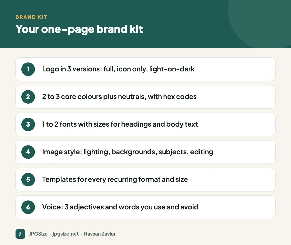
A brand guide does not need to be a 60-page document. One page covering logo usage, colour codes, fonts, image style, template links and voice is enough for most small businesses. Share it with everyone who creates content, including agencies and freelancers, and store it with your logo files in a shared folder.
Apply it everywhere
Audit every touchpoint once a year: website, favicon, social profiles and covers, Google Business Profile, email templates, invoices, packaging, signage and ads. Update anything that uses old logos, off-brand colours or inconsistent photo styles. Keep your profile photos and cover images consistent across platforms so people recognise you wherever they find you.
Common mistakes
- Using a detailed logo that becomes unreadable as a small profile picture.
- Picking trendy colours that clash with your product photography.
- Mixing many fonts and filters across posts.
- Letting every team member design in their own style.
- Changing the look frequently; consistency needs time to build recognition.
A step-by-step plan for a small business
- Collect what you have: every logo file, colour you have used, font and a sample of recent posts, web pages and printed materials.
- Decide what stays: choose the logo version, colours and fonts that best represent you today. Retire the rest.
- Fill the gaps: create missing logo versions (icon, light and dark), define exact colour codes and pick a body font if you only had a headline font.
- Define your photo style with three or four example images that feel right, and one editing preset.
- Build templates for the five formats you use most.
- Write the one-page guide and share it.
- Roll it out across your website, profiles and templates over a few weeks, starting with the most visible places: website header, social profile images and Google Business Profile.
How brand consistency supports SEO and AI search
Consistency is not only visual. Using the same business name, logo, description and contact details across your website, social profiles and directories helps search engines and AI systems understand that these profiles all belong to one entity. Organization structured data with your logo, and matching profile images everywhere, reinforce that connection. See generative engine optimization for why entity clarity matters in AI search.
Frequently asked questions
What is visual brand identity?
It is the set of visual elements that make a brand recognisable, including logo, colours, typography, image style and layout, applied consistently across every channel.
How many brand colours should a small business have?
Two or three core colours plus neutral colours for text and backgrounds is usually enough to be distinctive and flexible.
Do I need a professional designer for brand identity?
A designer helps, especially for the logo, but many small businesses build a solid system themselves with a clear brand kit and good templates.
How do I keep my brand consistent on social media?
Use templates with locked logos, colours and fonts, a consistent photo editing style and matching profile images across platforms, and follow a simple written brand guide.
Sources and further reading
About the author: Hassan Zaviar writes about image optimization, SEO, AI and digital marketing for JPGSize and works on the site’s free browser-based image tools. Last reviewed: 24 September 2026. Spotted something out of date? Tell us and we will update it.