A phone with a 390-pixel-wide screen does not need the same 1600-pixel image as a desktop monitor. Responsive images let you offer several versions of the same picture and let the browser download the one that fits, which saves data and speeds up pages without any visible loss of quality.
Quick answer: Add a srcset attribute listing several widths of the same image (for example photo-480.jpg 480w, photo-800.jpg 800w, photo-1200.jpg 1200w) and a sizes attribute describing how wide the image is displayed (for example “(max-width: 700px) 100vw, 700px”). The browser combines this with the screen’s size and pixel density to download the smallest file that will still look sharp.
Why a single image size is not enough
Screens vary from small phones to 4K monitors, and many have high pixel density (a “2x” or “3x” display packs two or three device pixels into each CSS pixel). If you serve one large image to everyone, phones waste data. If you serve one small image, big screens look blurry.
The byte difference is dramatic. The number of pixels grows with the square of the width, so a 1600-pixel-wide image has roughly four times as many pixels as an 800-pixel one, and usually a correspondingly larger file.
The two attributes you need
srcset: the menu of files
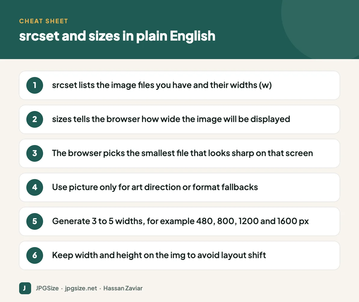
srcset lists the available files and their real pixel widths using the w descriptor. For example: hero-480.webp 480w, hero-800.webp 800w, hero-1200.webp 1200w, hero-1600.webp 1600w.
sizes: how big the image will be on the page
The browser has to decide which file to download before it has calculated the page layout, so it needs a hint about the display width. The sizes attribute provides that as a list of media conditions and widths, such as “(max-width: 700px) 100vw, 700px”, which means “on screens up to 700 pixels wide the image fills the viewport; otherwise it is 700 pixels wide”.
Given those two attributes, a phone with a 390-pixel-wide viewport and a 3x display needs about 1170 device pixels, so it picks the 1200w file. A desktop showing the image at 700 pixels on a 1x screen picks the 800w file. Neither downloads more than it needs.
The x descriptor for fixed-size images
For images that are always the same CSS size, such as a 64-pixel avatar, you can use density descriptors instead: avatar-64.jpg 1x, avatar-128.jpg 2x. No sizes attribute is needed.
When to use the picture element
picture is for two situations srcset alone cannot handle:
- Art direction: showing a different crop on small screens, such as a tight portrait crop on phones and a wide landscape on desktop.
- Format fallbacks: offering AVIF, then WebP, then JPEG, and letting the browser pick the first format it supports. See WebP vs AVIF vs JPEG for which formats to offer.
If you only want different sizes of the same image, srcset and sizes on a plain img element is simpler and preferred.
How WordPress handles responsive images
WordPress has generated srcset and sizes automatically since version 4.4. When you upload an image, it creates several resized copies (thumbnail, medium, medium_large, large and any sizes your theme registers) and adds them to srcset when the image is inserted into content.
That means the most important thing you can do in WordPress is upload a sensibly sized original. If your largest content column is 800 pixels wide, an original around 1600 to 2000 pixels wide covers high-density screens. Anything bigger just wastes storage. WordPress also scales down uploads larger than 2560 pixels by default. Use our resize image in pixels tool before uploading if needed.
How many sizes should you generate?
Three to five widths cover most layouts. A common set for content images is 480, 800, 1200 and 1600 pixels. For full-width heroes you might add 2000 or 2400. More sizes give the browser more precise choices but add storage and build time; beyond five the benefit is usually small.
Common mistakes
- Missing sizes attribute. Without it, the browser assumes the image is the full viewport width (100vw) and often downloads a much larger file than needed.
- Wrong sizes values. If your CSS changes the layout, update sizes too. Chrome DevTools shows which file was chosen in the Network panel so you can check.
- Listing widths that do not match the files. If photo-800.jpg is actually 1200 pixels wide, the browser’s maths is wrong.
- Forgetting width and height. Responsive images still need dimensions to prevent layout shift; see Core Web Vitals and images.
- Lazy loading the hero. srcset does not change the rule that the first image should load eagerly; see lazy loading and SEO.
Responsive images and SEO
Google can index images supplied through srcset and picture. Its image SEO documentation mentions both, and recommends always including a fallback src on the img element. Faster pages help Core Web Vitals, and properly sized images are one of the most reliable improvements you can make. For the wider picture, read our image SEO guide.
A quick way to test your responsive images
You do not need special tools to confirm that responsive images are working:
- Open the page in Chrome, open DevTools and switch to the Network panel with the Img filter selected.
- Turn on device emulation and choose a phone such as a Pixel or iPhone model, then reload the page.
- Check which file was downloaded for each image and compare its width with the size the image is actually displayed at. For a 2x phone screen, the file should be roughly twice the displayed CSS width, not four or five times.
- Switch to a desktop viewport and reload. A larger file should be chosen now.
If the phone downloads the biggest file every time, the sizes attribute is usually missing or wrong. If the desktop gets a blurry small file, your srcset probably lacks a large enough option.
Responsive images beyond websites
The same principle, matching the image to where it is displayed, applies everywhere. Social networks resize your uploads to their own sizes, email clients display images at a fixed width, and application forms often demand exact pixel dimensions and file sizes. Our guides to social media image sizes and email marketing images, and tools like resize image to 100KB, help with those cases.
Frequently asked questions
What is the difference between srcset and sizes?
srcset lists the image files and their widths. sizes tells the browser how wide the image will be displayed so it can pick the right file from srcset.
Do I need the picture element for responsive images?
No. Use picture only when you need a different crop on different screens or want to offer multiple formats with fallbacks. For size switching, srcset and sizes on img is enough.
Does Google index images in srcset?
Yes. Google supports srcset and picture, but you should always include a normal src attribute as a fallback.
What image widths should I create?
Three to five widths such as 480, 800, 1200 and 1600 pixels suit most content layouts. Add larger versions only for full-width hero images.
Sources and further reading
- MDN: Responsive images
- web.dev: Serve responsive images
- Google Search Central: Image SEO best practices
About the author: Hassan Zaviar writes about image optimization, SEO, AI and digital marketing for JPGSize and works on the site’s free browser-based image tools. Last reviewed: 24 September 2026. Spotted something out of date? Tell us and we will update it.