A landing page has one job: persuade a specific visitor to take a specific action. Unlike a homepage, which serves many audiences, a good landing page removes distractions and answers exactly the questions that stand between the visitor and a yes. Small improvements here multiply the value of every ad, email and social post that points to it.
Quick answer: To optimise a landing page, match the message of the ad or link that brought visitors, state the outcome in a clear headline, focus on one call to action, show the product or result with a strong image, lead with benefits and proof, keep forms short, make the page fast on mobile and add trust signals. Then test one significant change at a time and measure conversion rate, not just clicks.
The 12 elements
1. Message match
The headline and offer on the page should match what the visitor clicked. If the ad says “20% off leather laptop bags”, the page should open with that offer and those bags, not a generic homepage. Mismatches make people feel lost and leave.
2. A clear headline
State the outcome the visitor wants in plain language. “Resize your photo to under 50 KB in seconds” beats “Next-generation image solutions”. Support it with a subheadline that adds specifics: who it is for, how it works or what makes it different.
3. One primary call to action
Decide the single action you want: buy, book, sign up, call or download. Make the button specific (“Get my free quote”, not “Submit”), visually prominent and repeated after key sections on long pages. Remove competing links such as full navigation menus where you can.
4. A hero image or video that shows the result
The main visual should show the product, the outcome or a real person using it, not an abstract stock photo. It is also usually the largest element on the page, which makes it critical for speed. Compress it and follow our Core Web Vitals and images guide so it does not slow the page.
5. Benefits before features
Visitors care about what changes for them. Translate features into outcomes: “Water-resistant full-grain leather” becomes “Stays smart through monsoon commutes”. List features afterwards for those who want detail.
6. Social proof
Reviews, ratings, testimonials with names and photos, client logos, case study results and numbers of customers served. Specific, verifiable proof beats vague praise. Never invent testimonials.
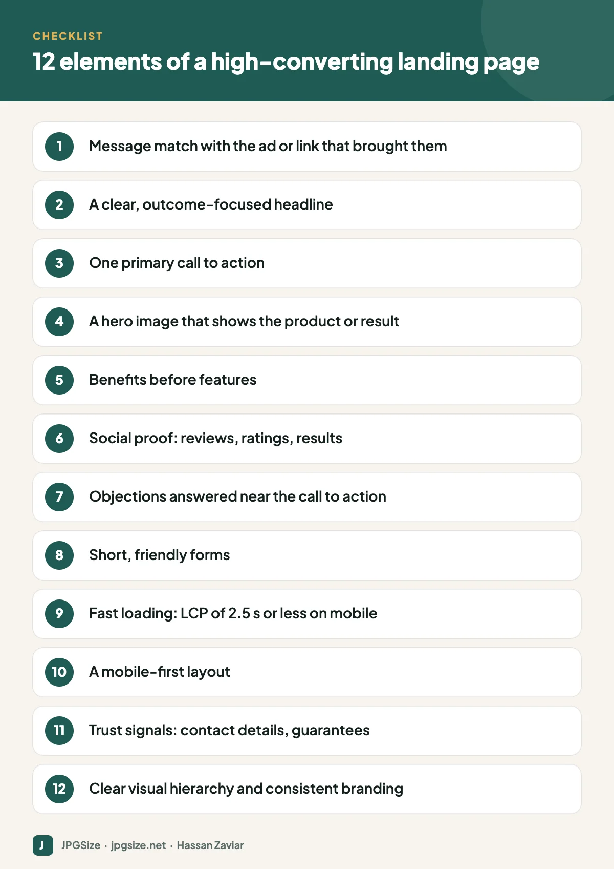
7. Objection handling
List the reasons people hesitate (price, delivery time, sizing, commitment, data privacy) and answer each one on the page, often in a short FAQ section near the call to action.
8. Short, friendly forms
Every extra field reduces completions. Ask only for what you need now; you can gather more later. Use clear labels, input types that bring up the right mobile keyboard, helpful error messages and a visible privacy note.
9. Speed
A slow page loses visitors before they see your offer, and every lost visitor from a paid ad is money wasted. Aim for a Largest Contentful Paint of 2.5 seconds or less on mobile. Compress images with our JPG compressor, avoid heavy sliders and remove unnecessary scripts. The website speed checklist covers the rest.
10. Mobile-first layout
Most landing page traffic from social ads is mobile. Check that the headline, a key image and the call to action are visible without scrolling on a phone, buttons are easy to tap and text is readable without zooming.
11. Trust signals
Show a real address or phone number, secure checkout indicators, guarantees, return policies, recognisable payment options and any relevant certifications. For local services, link your Google Business Profile reviews.
12. Visual hierarchy and consistency
Use spacing, headings and contrast to guide the eye from headline to proof to action. Keep fonts and colours consistent with your ads and brand so visitors feel they are in the right place; see visual brand identity.
How to test improvements
- Measure a baseline: conversion rate (conversions divided by visitors) by traffic source and device, using GA4 key events. See GA4 for beginners.
- Find the biggest leak: use scroll depth, heatmaps or session recordings to see where people drop off.
- Form a hypothesis: “Moving reviews above the fold will increase sign-ups because visitors doubt our quality.”
- Test one significant change at a time, with an A/B testing tool if you have enough traffic.
- Run tests long enough to cover full weeks and reach a meaningful sample; stopping early often produces false winners.
- Keep a log of tests and results so learning compounds.
Low-traffic sites can still improve by fixing obvious problems (speed, message match, clarity) and comparing before-and-after periods carefully.
Landing pages and SEO
Paid landing pages are often set to noindex because they duplicate other content or are campaign-specific. Evergreen landing pages, such as a service page or a tool page, should be indexable and optimised for search intent. The same principles of clarity and a direct answer help both conversions and answer engine optimization.
Landing page examples by goal
| Goal | What the page needs most |
|---|---|
| Lead generation for a service | Clear outcome, proof from similar clients, short form, fast response promise |
| E-commerce product promotion | Product images and price above the fold, reviews, delivery and returns info, add-to-cart button |
| Event or webinar sign-up | Date, time and time zone, what attendees will learn, speaker credibility, one-click registration |
| App or tool | Screenshot or live demo, key benefit, free trial or instant use, privacy reassurance |
| Local business offer | Offer details, location and map, opening hours, call and WhatsApp buttons, reviews |
A 15-minute landing page audit
Open your page on a phone and answer honestly: Can I tell what is offered and for whom within five seconds? Is the call to action visible without scrolling? Does the page load quickly on mobile data? Is there proof that other people trust this business? Are the obvious objections answered? Is the form as short as it could be? Any “no” is your next improvement, and usually more valuable than testing button colours.
Frequently asked questions
What is a good landing page conversion rate?
It varies widely by industry, offer and traffic source. Compare against your own baseline and aim for steady improvement rather than a universal benchmark.
What is the most important element of a landing page?
Message match and a clear headline usually have the biggest impact, because they determine whether visitors stay long enough to read anything else.
Should landing pages have navigation menus?
Campaign landing pages often convert better with minimal navigation, because it removes distractions. Keep essential trust links such as privacy policy and contact details.
How fast should a landing page load?
Aim for Largest Contentful Paint of 2.5 seconds or less on mobile. Slow pages lose visitors and waste ad spend.
Sources and further reading
- web.dev: Web Vitals
- Nielsen Norman Group: F-shaped pattern of reading on the web
- Google Ads Help: About landing page experience
About the author: Hassan Zaviar writes about image optimization, SEO, AI and digital marketing for JPGSize and works on the site’s free browser-based image tools. Last reviewed: 24 September 2026. Spotted something out of date? Tell us and we will update it.